Projects
Services
About
Contact
Menu
Projects — Presenting some of our cases
(All)
(Behind the scenes)
(Brand Identity)
(Campaign)
(Case studies)
(UX/UI)
(Website)
A fresh digital presence for Matt Sleeps – redefining the sleep experience digitally
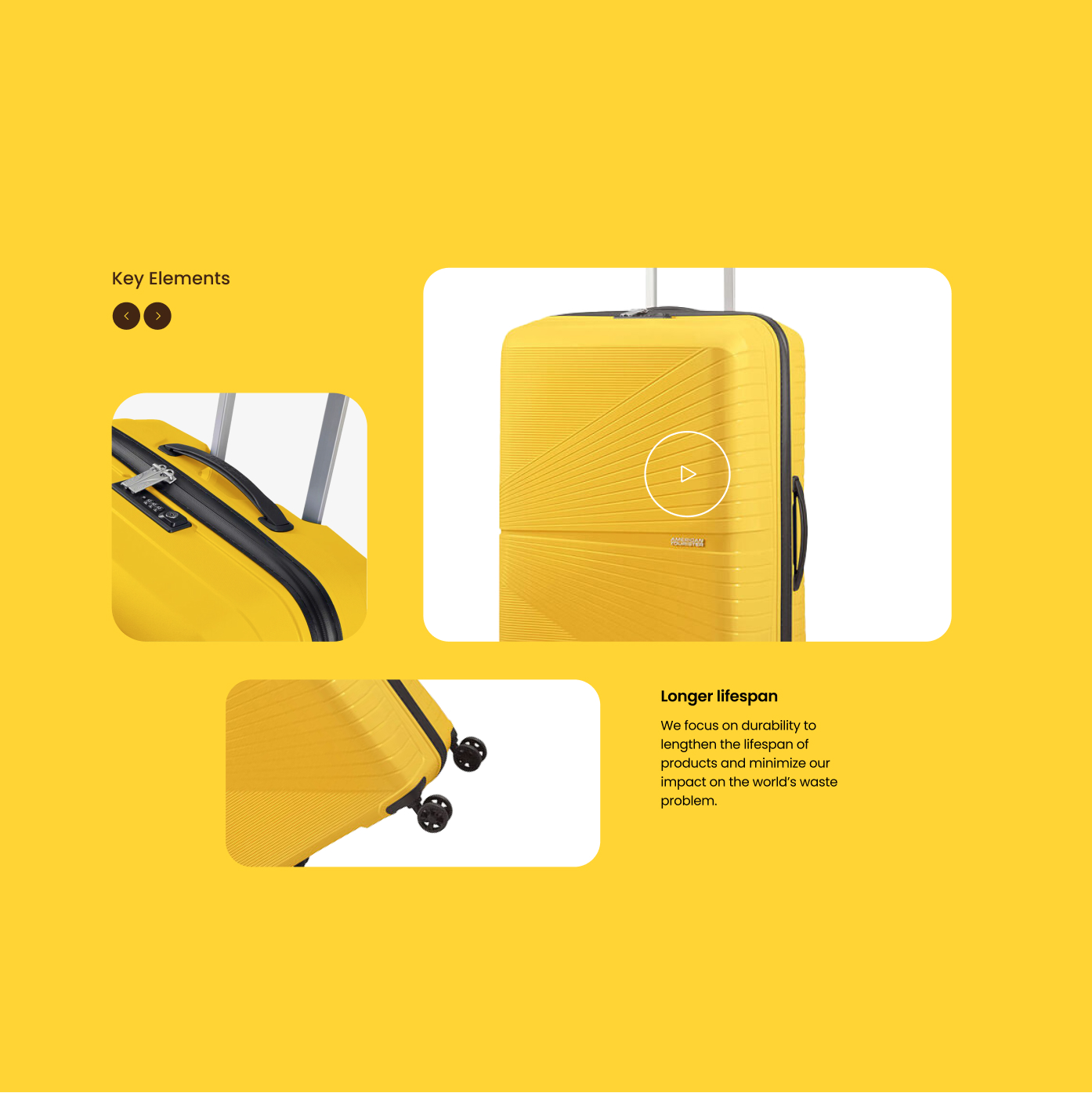
User experience design for one of the leading luggage brands in the world
Branding, website and app design for the Betcity community to wave their flag.
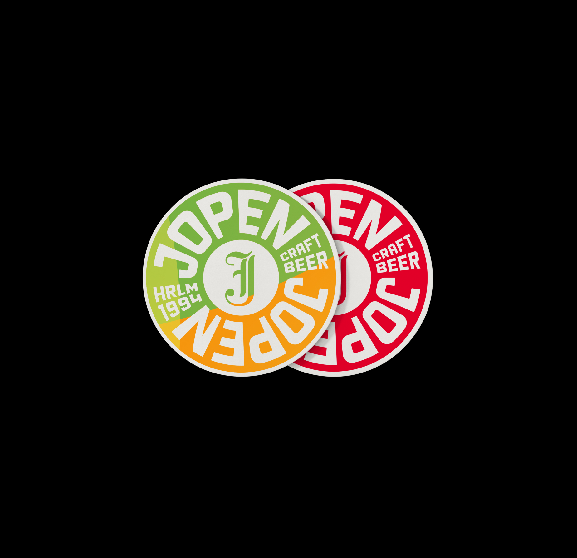
Enhanced visual identity campaign to match Jopen’s abnormally delicious beers
Webtool for Heineken x Boomerang
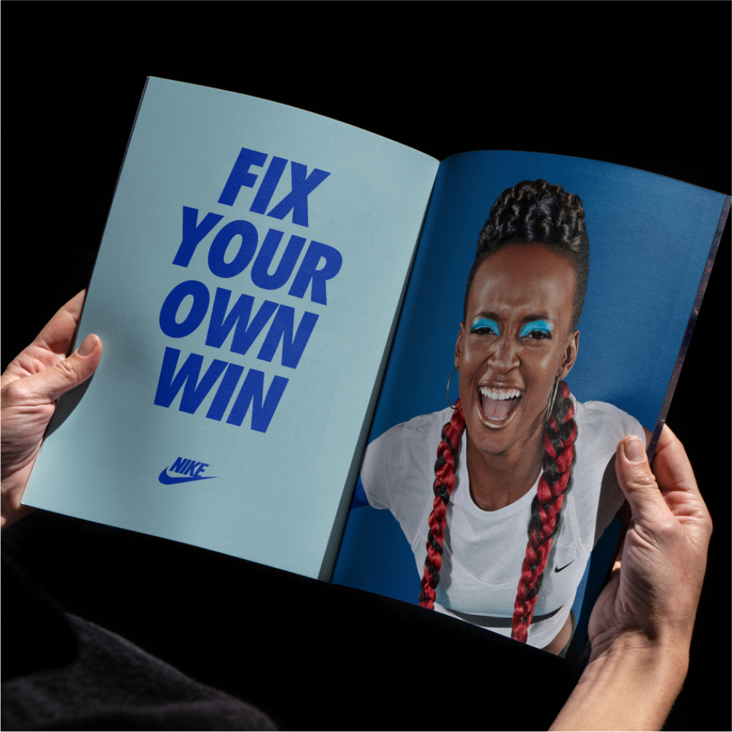
Women empowerment campaign for Nike’s every day sport gear
Rebranding that reflects the intuitive building blocks of the platform
Branding, Identity and Website Design for Femmefab
Visual identity and digital application for a disruptive startup
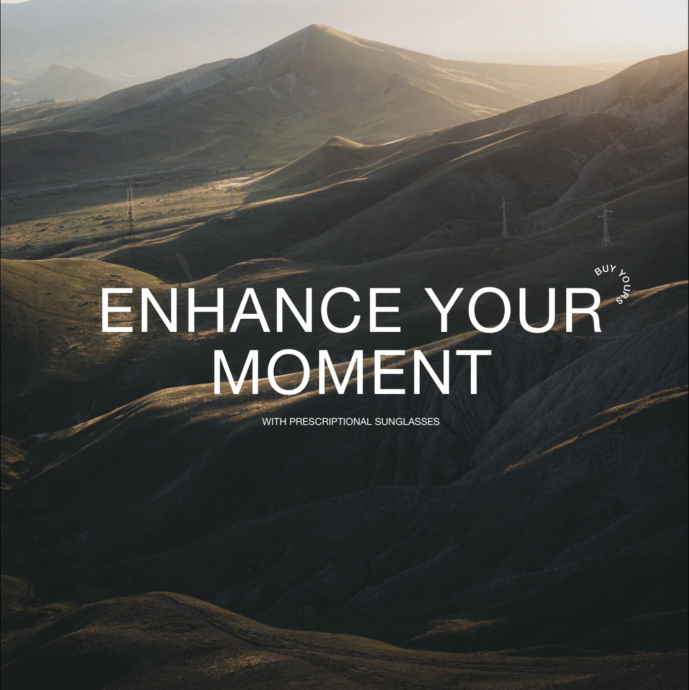
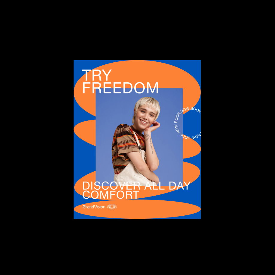
Global Design Campaign for GrandVision
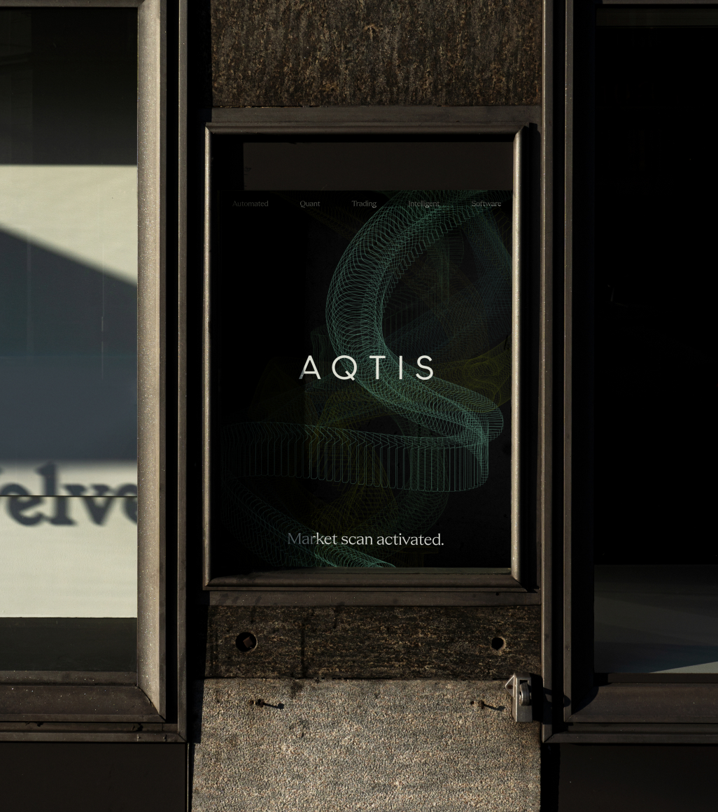
Branding and website design for liquidity flow software, AQTIS.
Rebranding and website design for DSTRCT’s architectural wonders
Rebranding and website design to let talents shine for L’AGENCY
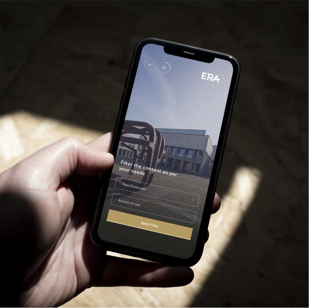
Visual and technical design for a complex European training and learning platform
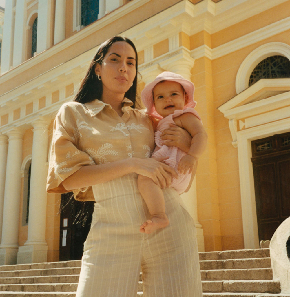
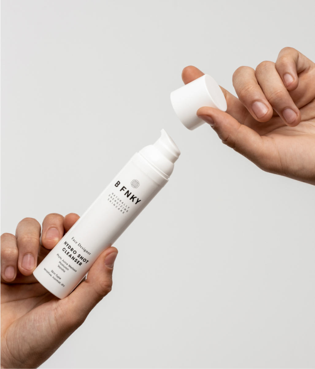
Rebranding and development to boost people’s natural energy
Visual Identity and branding concept
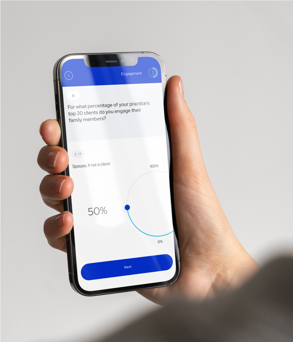
Transforming complex financial advice into clear people-centred insights
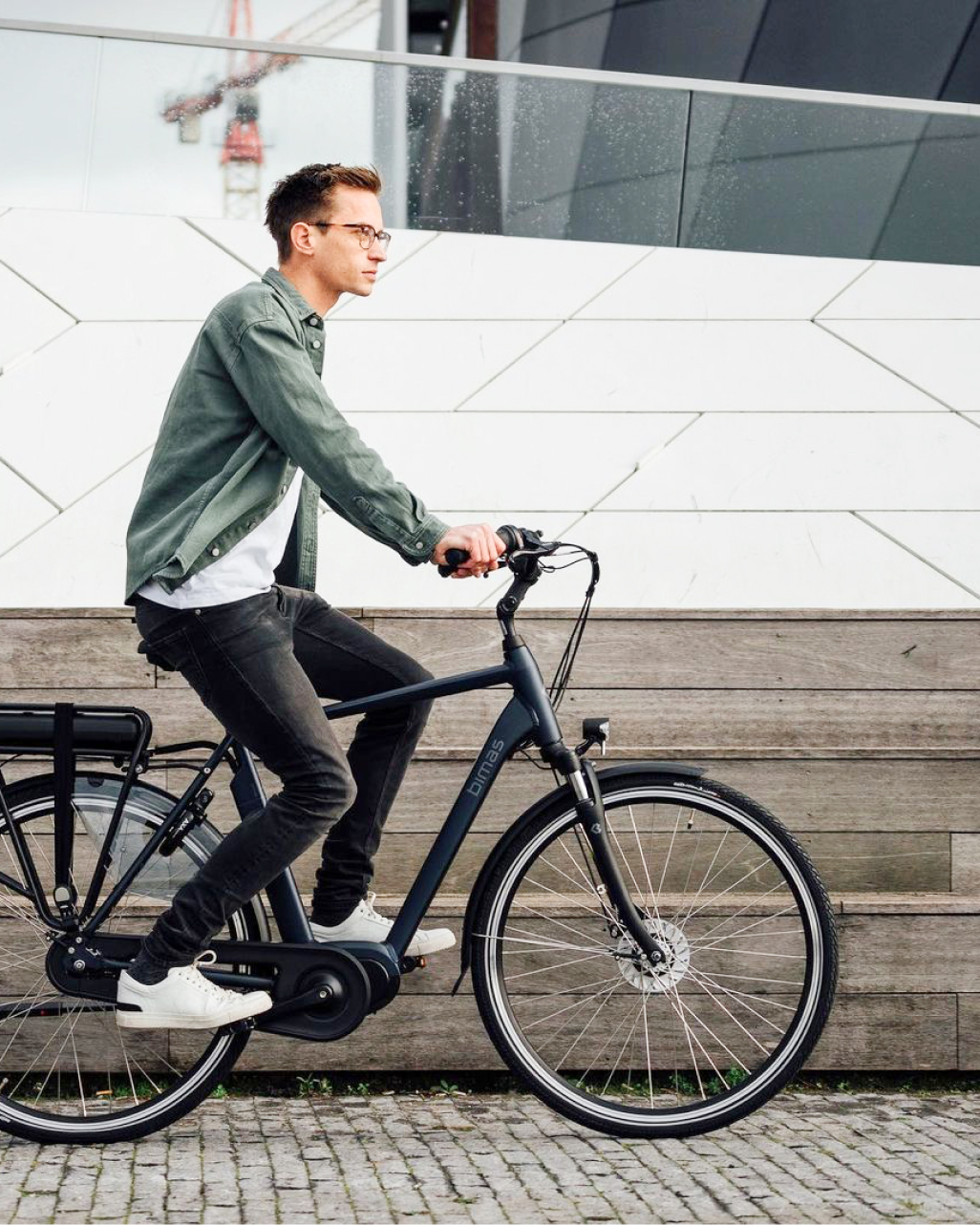
Website Design for Bimas
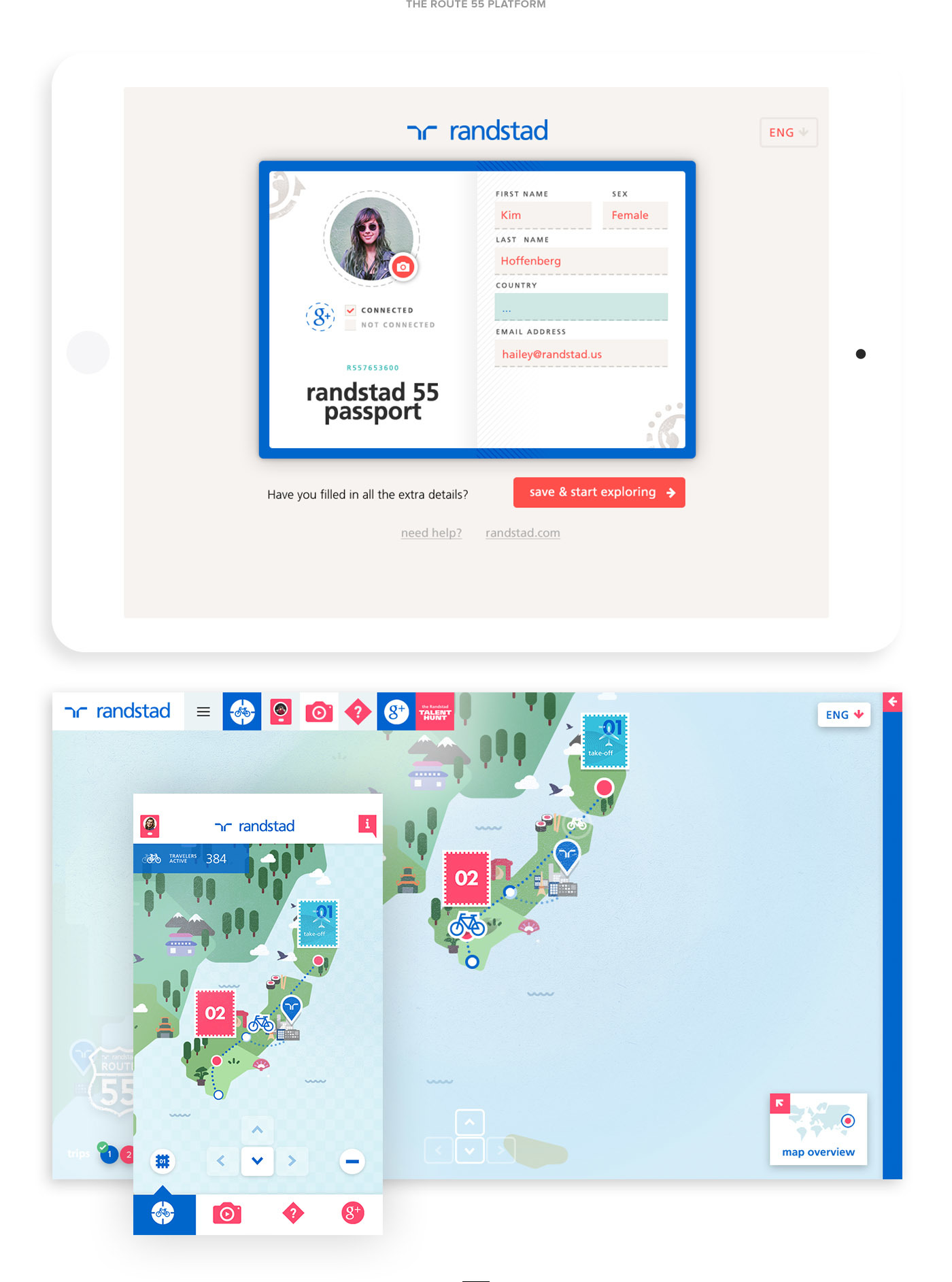
Application and online platform for Randstad Route 55
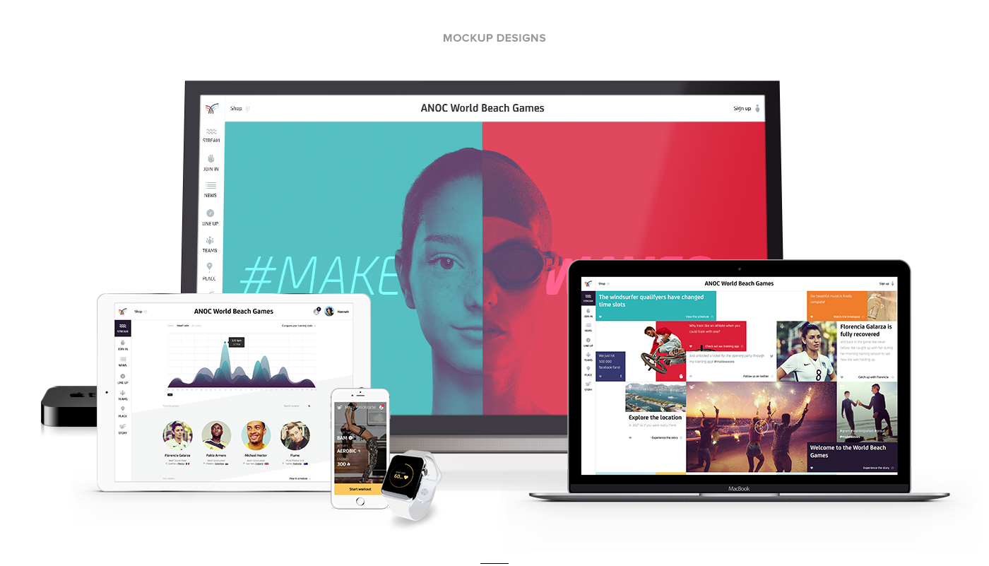
Digital Strategy for ANOC World Beach Games
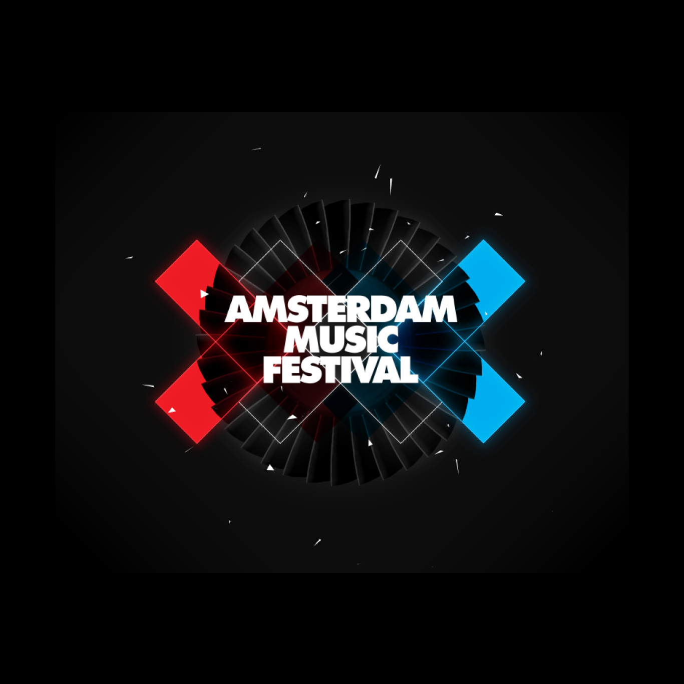
Website Design for Amsterdam Music Festival
Website
2016
Website and Identity for NPB Media
Brand Identity
2016
Digital Campaign for GrandVision
Campaign
2022
(Close)
Projects
(01)
Services
(02)
About
(03)
Contact
(04)
Instagram
LinkedIn
Your browser does not support the video tag.